It’s easy to make a big mess out of decorating a small space, thus making it seem even smaller than it really is. Just as there are tips and tricks that help open up a tiny area and take advantage of limited room, there are also some common mistakes that instantly shrink an already small space. When it comes to designing a small house or apartment, every square foot matters. Take a look at this handy guide to find out some of the most prevalent small space design mistakes to avoid.
Having too much furniture
When it comes to making the most of a tiny living area, the simple adage “less is more” has never been truer. It’s important not to go too crazy with home interior decor and choose the right ones only.
Stuffing every corner of the house or apartment with furniture can make it feel overwhelming, crowded, and uncomfortable. It’s better to pare down the furniture to the bare necessities, with some clever and economical decorative pieces added in to breathe life into the space. Multi-purpose furniture like Murphy beds which double as a storage space and a bed also offers some unique and effective small space design solutions.
Adding heavy curtains
Curtains are used to block out sunlight and to maintain privacy. Thick, heavy-set curtains aren’t necessary to be able to achieve this, particularly if the main concern is making good use of a small space. It’s better to invest in lightweight curtain fabrics that can still get the job done while allowing in as much natural light as possible to make the space feel open and spacious.
Not getting accurate measurements
Furniture pieces that are way too small or way too big for a space can instantly make it seem smaller than it already is. Small furniture can make a room feel too empty to the point where it’s almost suffocating, while large, unwieldy furniture can obviously take up too much space that there isn’t much of to begin with.
This is an incredibly common design problem that has an effortless solution: just accurately measure every room and area in the house or apartment. Floor plans are usually not very reliable, so it’s better to take the liberty of doing it yourself with an old-fashioned tape measure.
When purchasing furniture, it’s best to go with pieces that are scaled to the area where you’ll place it. Make sure it’s not too small, but also ensure that there’s still some space to move around it. There are certain shops that specifically sell pieces that are aimed towards small-scale houses and apartments, like Urban Outfitters, H&M Home, Apt 2B, and Anthropologie — so it’s best to hit these places up first.

Underestimating the value of good lighting
Strategic lighting can make an otherwise tight space feel much more open and airy. Overhead lighting fixtures and small table lamps are especially useful since they don’t occupy any floor space. A floor lamp or two is also fine, as long as they aren’t too bulky. Mirrors and reflective surfaces should also be utilized since they can bounce back as much available light as possible, illuminating the space even further.
Painting the walls with the wrong colors
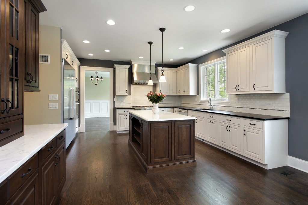
Dark, moody colors are great for accent walls, but painting every single available wall with these kinds of hues can make a space feel oppressive and stuffy. On the other hand, colors that are overly saturated and much too bright can also have the same effect. It’s best to go with light, neutral colors such as cream, beige, light gray, blush pink, and ivory which are neither too gloomy nor too intense. Pops of color should be reserved for small accent pieces instead.
Not organizing clutter
There’s nothing that effectively shrinks a space more than clutter. A disorderly space with clothes, cords, and various knickknacks all littered about can make a space feel incredibly cramped and claustrophobic. Make sure to invest in clever storage solutions to make it easy to organize any mess. It also helps to pare down belongings to only the bare minimum by donating or selling all other unnecessary items.
Using too many patterns
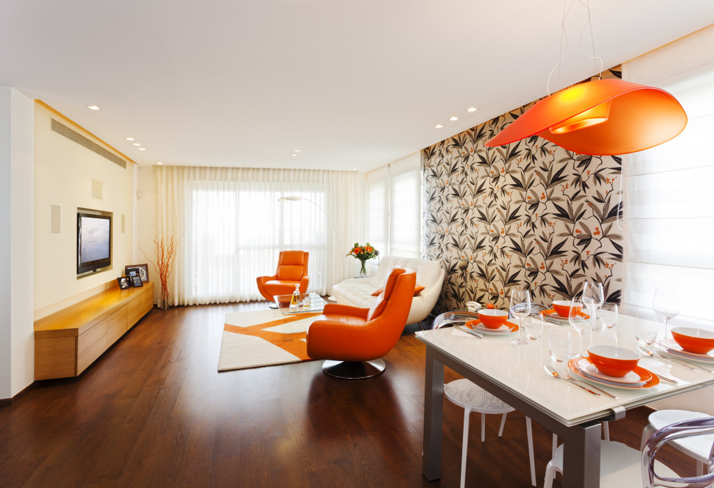
Patterns are useful for striking accent walls or eye-catching small decorative pieces. When used correctly, they can off the illusion of a bigger space. However, too many busy patterns can clash and make a small area feel even smaller. When dealing with patterns, it’s best to keep them at a minimum and be strategic about their placement. A small accent pillow or a patterned backsplash is fine, but covering every inch of a room’s walls with patterns is not.
Avoiding these common interior design mistakes ensures that you’ll make the most out of the tiny space you’re given.


